For this Week, I reviewed two classmate's blogs; Anthony Cancemi, http://aed200.blogspot.com/ and Joshua Vail http://vailj01.blogspot.com/.
In Anthony's blog assignment #1 (Elements and Principles) I felt that all of the photographs portrayed the characteristic it was intended to represent. Each captured the elements and principles of design. I especially like his photograph for Shape entry. I also see this as a more complex composition that has line, texture, value and balance.
In Joshua's blog assignment #1, I also feel he has successfully executed the assignment. The photographs for shape, rhythm and balance strike me as studies that can be developed further. "Space" has so much going on, even though at first it appears a simple composition. I see form, texture, value and balance all in this one photograph.
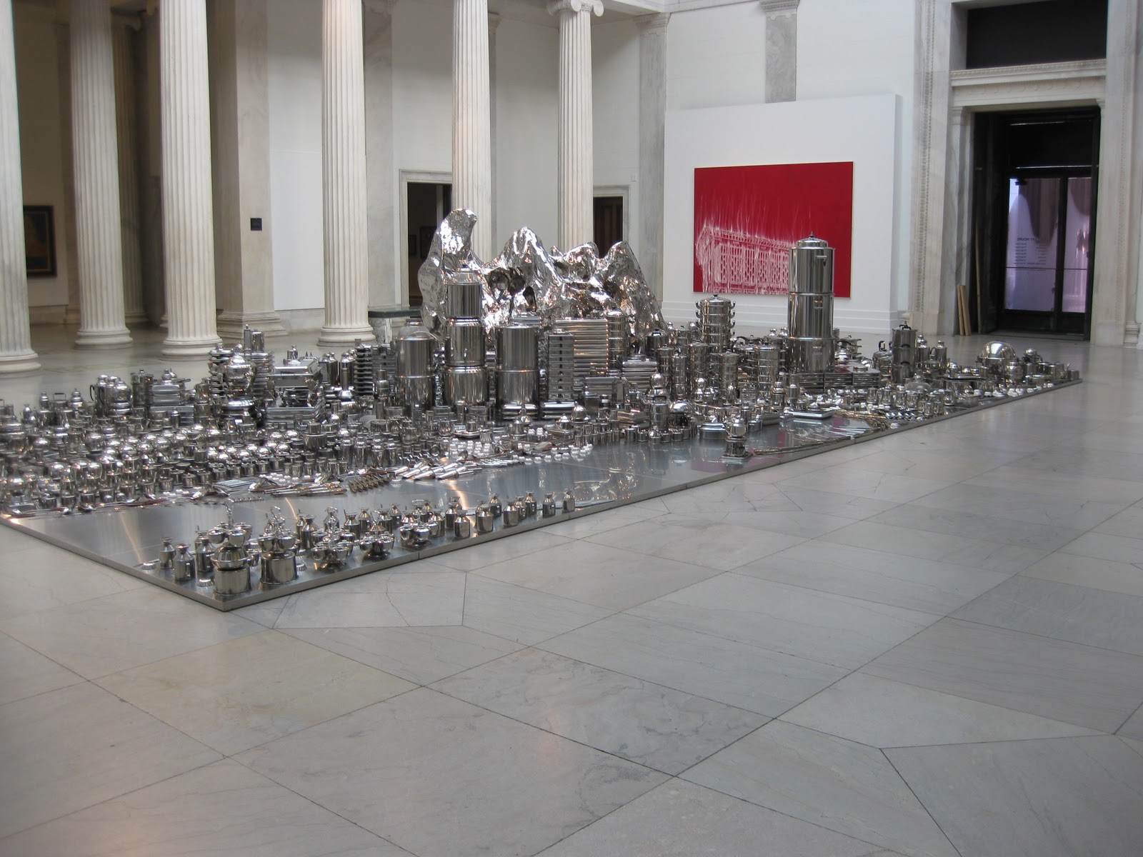
Both Anthony and Joshua noted images that I also commented on from my visit to the Albright Knox Art Gallery. These include Gary Simmon's, "D.C. Pavillion", Zhan Wang's "Urban Landscape Buffalo, Sol LeWitt's, "Wall Drawing #1268", and Jess', "The Unentitled Graces". Some of the reasons the artworks were selected were for similar reasons and some were not, but the fact remains, the artworks left impressions on us even in different ways.
My interest was peeked in two of the works that Anthony and Joshua noted. First, Matthew Ritchie's, "Morning Wars" prompted me to do a search of the piece on the AK website, where I found an interview with Ritchie regarding his installation and the recently purchased work. Robert Longo's , "Hum" also is an artwork that I would like to know more about. I would like to know more about how the pieces were created and what do they represent? I am always drawn to images that seem rather simple, yet the techniques used are complex.
The process of reading my peers reflection is a great way to have a dialog in an on line environment when we do not have the opportunity to have a group discussion in class, or to tour a gallery as a group. I find this to be a helpful tool in the process of learning about art and the reactions we all have to art.
I am eagerly awaiting comments that will be posted by my Peers. Positive or Negative, I am sure I will find their comments helpful.
Sunday, February 27, 2011
Thursday, February 24, 2011
Week 5: Art Gallery Visit #1-Responding to Artwork
Which artworks make an impact or impression on me?
Why?
Claes Oldenburg, "Soft Manhattan #1" (Postal Zones), 1966. Stenciled Canvas filled with Kapok, 70 x 26 x 4" is a fabulous contradiction in respresentation. Manhattan, often referred to as "the concrete jungle" is depicted in a 3D soft sculpture. This left an impression on me because of this. It is a great concept - something hard, represented as soft- that I would like to consider for a future project.

"Untitled" by James Nares. 1995, oil and enamel on paper, 48 x 36"is a visually balanced composition that appears to have been created under control, yet the over all composition has elements that also appear to have happened by chance. At first, it seemed to me that the work was done on fabric but it was done on paper. It left me wondering how he acccomplised the circular image, so I Googled him and saw an image of him suspended on a swing/sling over the horizontal surface. Very intrigued by the other work I found in Google images.

Finally, "The Tow-Path at Argenteuil" Claude Monet. 1875 oil on canvas 23 4/8 x 39 3/8" is a master of Impressionism's depiction of fading winter along a harbor. The composition is balanced in color, in light, in object placement. The implied lines are soft, yet defined and the viewer's eyes travel throughout the piece. Aesthetically alive with feeling of peacefulness, I could feel the mist of fog on my face.

Which artworks do I feel a connection with? Why?
It didn't take me long to be drawn to one of the first paintings on exhibit at the Albright Knox Art Gallery, Buffalo, NY. This painting was "The Beadstringers"1882, by John Singer Sargent, oil on canvas, 26 3/8" x 30 3/4"because of the affinity I have for artwork depicting women in the 19th century participating in handwork. The artwork has very little light, only entering the windows and doors on the left and the skirt of the woman standing on the right. This is odd for the craft which requires light! I have always had an intuition that in a former life, I worked in the embroidery ateliers in Paris or Florence.
 Piet Mondrian Composition No. 11, 1940-42, Oil on Canvas, made me smile as I recognized the painting as an image that is vastly repeated in the fashion and interior design industries. I've seen it on dresses, sneakers, and glasswear. It brought back a fond memory of a dress my mother had in the 1970s (I'm sure a designer knockoff). When she wore it, I always felt the need to draw x's in the blank spaces!

In addition to the two previously acknowledged works, "The Unentitled Graces", by Jess 1978, Paper Collage 41 1/4" x 61 1/4" fascinated me. By nature of collage, there is just so much to find in this piece, that I am including a full view photograph and a detail. Many parts of the piece had "ah, Oh I know remember that", attributes. This piece makes me think of growing up in Western New York in the 1960-1970s.


Which artworks would I like to know more about? Why?
I would like to know more about Zhan Wang's "Urban Landscape Buffalo. Stainless Steel pots, pans and kitchen utensils. Installation. It is such a complex structure, with what seems to be endless supply of restaurant kitchenware, I would like to know how he conceived of the idea.....what brought him to use these products to illustrate the urban landscape? Amazing.
 I would also like to know more about Gary Simmons' "D.C. Pavillion" 2007 Pigment, Oil paint, and cold wax on canvas, 84x120". How does he use the mediums in the piece to achieve a velvet-like surface appearance intrigues me.

Byron Kim's "Commission for Synecdoche", 2008, oil and wax on wood fascinated me from across the gallery. Much deeper in meaning, politically and racially, than the on the surface look of a variety of colors of kitchen cabinet panels in Home Depot, the composition brings all races together in a symbolically unified way without bringing faces, history, prejudice or hatred to the wall. What a wonderful way to define the human race. I'd like to know more about this concept.

Why?
Claes Oldenburg, "Soft Manhattan #1" (Postal Zones), 1966. Stenciled Canvas filled with Kapok, 70 x 26 x 4" is a fabulous contradiction in respresentation. Manhattan, often referred to as "the concrete jungle" is depicted in a 3D soft sculpture. This left an impression on me because of this. It is a great concept - something hard, represented as soft- that I would like to consider for a future project.

"Untitled" by James Nares. 1995, oil and enamel on paper, 48 x 36"is a visually balanced composition that appears to have been created under control, yet the over all composition has elements that also appear to have happened by chance. At first, it seemed to me that the work was done on fabric but it was done on paper. It left me wondering how he acccomplised the circular image, so I Googled him and saw an image of him suspended on a swing/sling over the horizontal surface. Very intrigued by the other work I found in Google images.

Finally, "The Tow-Path at Argenteuil" Claude Monet. 1875 oil on canvas 23 4/8 x 39 3/8" is a master of Impressionism's depiction of fading winter along a harbor. The composition is balanced in color, in light, in object placement. The implied lines are soft, yet defined and the viewer's eyes travel throughout the piece. Aesthetically alive with feeling of peacefulness, I could feel the mist of fog on my face.

Which artworks do I feel a connection with? Why?
It didn't take me long to be drawn to one of the first paintings on exhibit at the Albright Knox Art Gallery, Buffalo, NY. This painting was "The Beadstringers"1882, by John Singer Sargent, oil on canvas, 26 3/8" x 30 3/4"because of the affinity I have for artwork depicting women in the 19th century participating in handwork. The artwork has very little light, only entering the windows and doors on the left and the skirt of the woman standing on the right. This is odd for the craft which requires light! I have always had an intuition that in a former life, I worked in the embroidery ateliers in Paris or Florence.


Which artworks would I like to know more about? Why?
I would like to know more about Zhan Wang's "Urban Landscape Buffalo. Stainless Steel pots, pans and kitchen utensils. Installation. It is such a complex structure, with what seems to be endless supply of restaurant kitchenware, I would like to know how he conceived of the idea.....what brought him to use these products to illustrate the urban landscape? Amazing.

Byron Kim's "Commission for Synecdoche", 2008, oil and wax on wood fascinated me from across the gallery. Much deeper in meaning, politically and racially, than the on the surface look of a variety of colors of kitchen cabinet panels in Home Depot, the composition brings all races together in a symbolically unified way without bringing faces, history, prejudice or hatred to the wall. What a wonderful way to define the human race. I'd like to know more about this concept.

Week 5: Logo Design
What a fun assignment this has been! Designing my logo has been something that I have put off for quite a while. Before returning to Western New York in 2009, I owned a company in New Jersey and had drawn a logo myself. I just sketched without giving any thought to the elements and principles of design. I will include these in this assignment just for reference showing how the logo was used on my business card and a pan face sign on the front of my building.

 Now, as I pursue my passion in the fiber arts, I am glad that I had reason to begin development on my new logo. This isn't as easy as drawing Dr. Gelcoat! My work encompasses so many different aspects of fiber arts. I felt, I bead, I design and sew garments made from fabrics I create surface designs upon....so the challenge to incorporate all of this, I find, probably requires a professional. I consider the work I've done, on the right track, and I do like my final concept.
The most important discovery I made in this endeavor was that I wish I knew how to use Photoshop and Illustrator. I have limitations in my illustration skills. As an artist, I should sketch more. I keep journals of ideas, and then I just execute them, rather than sketch them out.
Watching the videos, powerpoint, and reading the material broadened my interest in graphic design and has me thinking about ways to create a pattern to print on fabric that could be my signature to use in linings. The videos are wonderful insights into the field of graphic design companies and how each persons responsibilities fall into play. In the first video, the whole episode seemed so staged and in my opinion the design left a great deal to be desired and didn't represent something "dynamic" at all. The product packaging redesign in the second video was far more interesting to me simply because I am always redesigning packages in my head when I don't like something.
The following images are my attempt at designing my logo. These are the first two concept sketches, including some play with my initials.
 This sketch tried to incorporate a both a piece of fabric and a finished evening bad. Eh.....not there yet.
 This exploration now identifies what I do but I'm still not feeling it.
 This is much closer to what I would like to see, but feel that a true graphic design professional would be able to refine the design. I really like the fact that my initials are M W which gives alot of opportunity to manipulate them. There is a balance, even though the upper right is larger, because the solid black initials in the center lead the eye spiraling down to the left where the text of my name is. The handwritten text provides the information and somewhat fills a negative space. Ultimately I'd like to see typography, even if the font is a handwriting font, create the text, not my actual writing. This would make it possible to stretch the text, curve it, etc., to make the logo complete. I'm pleased with the outline serving as a frame, so that the design can stand alone.
 In Photoshop, which I have never used before, I attempted to manipulate my initials to create a "signature" using just the initials. I can see using this as a "stamp" or simple embroidered identification mark. It still needs some development, but I would like to include it here, because I did explore this while working on this assignment.


The most important discovery I made in this endeavor was that I wish I knew how to use Photoshop and Illustrator. I have limitations in my illustration skills. As an artist, I should sketch more. I keep journals of ideas, and then I just execute them, rather than sketch them out.
Watching the videos, powerpoint, and reading the material broadened my interest in graphic design and has me thinking about ways to create a pattern to print on fabric that could be my signature to use in linings. The videos are wonderful insights into the field of graphic design companies and how each persons responsibilities fall into play. In the first video, the whole episode seemed so staged and in my opinion the design left a great deal to be desired and didn't represent something "dynamic" at all. The product packaging redesign in the second video was far more interesting to me simply because I am always redesigning packages in my head when I don't like something.
The following images are my attempt at designing my logo. These are the first two concept sketches, including some play with my initials.


Monday, February 21, 2011
Week Three: Color Theory and Emotional Effects
Color is the property possessed by an object of producing different sensations on the eye as a result of the way the object reflects or emits light. Many studies have proven that color affects us psychologically and often can give us physiological responses as well. Warm colors, red-orange, encourage an active response in our feeling and behavior. Cool colors, blues and greens, give us a calming response.
The theoretical aspect of color that most fascinates me is that objects have no color without light. the fact that this all depends on a physiological activity of the human eye and the science of electromagnetic wavelengths combine to make us SEE color. This intrigues me because it just makes me think if it is totally dark, with no light present, is my purple chair purple or is it absent of color? It's somewhat like the sound principle, if sound is something that is heard, and a tree falls in the forest with no one there to hear it, does it make a sound?
In the Color video, I was most intrigued by learn about fresco painters from the Middle Ages, explanation of Titian's technique and use of color, and mostly the sources of exotic colors and how they were made. I am fascinated by the purity of the colors, and how calming the blues of the Virgin's robe are, and how intense the many values of red were used.
In the Feelings video, it was the impact of David's use of strong shapes and warm colors portraying a noble, stately event, while the use of blues in the mother's gown brought forth a feeling complacency or a grief that she experiences. Without looking at the emotions on her face, I could tell by his use of blues, the woman felt saddened by the triumphant actions of the sons.
Thursday, February 17, 2011
Week Four Value Scale and 6-step Color Wheel
Creating the value scale and color wheel was repetitive for me, as I have completed both several times in other art classes. It is a necessary step in learning to work with different mediums.
I preferred working with the HB pencil to create the value scale. The medium offers more flexibility in correction than does acrylic. The brushes I had available to me to work with on the 6-step color wheel were not the best and did not enable me to create crisp edges, and stray hairs were annoying. Working with the acrylic colors, however, give many possiblities to make variations colors.
The most important discovery in the creation of these studies, was simply the use of a sub par quality of brushes, and with the acrylics, it would have been better to to use good brushes.
The video, Color Theory 2: Paint/Pigment Primary colors. The Truth!!!, was a quick and entertaining expression of what really makes black not brown. It clearly made sense as to why when we purchase inks for our printers, we don't just buy red, yellow and blue, but cyan, magenta and yello.
Below are my renditions of the Value Scale and Color Wheel. My concern with the color wheel is that the violet section does not transfer to digital media as well as it shows on my paper.


Tuesday, February 8, 2011
Elements and Principles of Design
This week, I had fun sifting through folders of photographs in order to analyze their compositions. Searching for elements and principles of design, also gave me an opportunity to critique my photographs from an art perspective. Some of my compositions were very good, and some, like many people do, are indicative of taking a picture to catch the moment quickly without thought about elements that interfere. Some photos offered me the opportunity to think about how the compositions could be better but considering the elements and principles more so than just quick clicks of the shutter to catch the moment.
http://s1140.photobucket.com/albums/n576/monicawhite4/Elements%20and%20Principles%20of%20Art/?albumview=slideshow
http://s1140.photobucket.com/albums/n576/monicawhite4/Elements%20and%20Principles%20of%20Art/?albumview=slideshow
Tuesday, February 1, 2011
Week Two, Video Review Blog
After viewing the video, AESTHETICS: PHILOSPHY OF THE ARTS, I had no clearer defined concept of what the philosophy of aesthetics in art is, than I did prior to viewing. However, I learned that I should not try to define aesthetics in art but to observe and absorb aesthetics. I'm inclined to agree with Morris Weitz' theory in the 20th century to release art from necessary conditions, not to reach for a definition of art but to embrace the roles and ideas conveyed in art.
Contrasting the aforementioned video, in CARTA: Neurobiology Neurology and Art and Aesthetics, Jean-Pierre Changeux's lecture material was very interesting but his method of delivery left me needing to review this several times, as I had difficulty keeping my focus. Vilayamur S. Ramachandran's lecture was much easier for me to grasp and I enjoyed it very much. I viewed and recorded in my notes his proposed eight laws of aesthetics. When I reviewed my notes, the eight laws as I listed them, made sense to me in regard to how I observe a work of art. Grouping and binding, peak shift of principles, contrast, isolating a single cue, perceptual problem solving, symmetry, abhorrence of visual vantage points, and art as a metaphor gave me the "a ha" moment. Both scientists have valid scientific observations, however, Ramachandran's presentation was charismatically captivating. Ramachandran's observations strongly related to chapter 3 by referencing the themes of art presented in LIVING WITH ART. However, he tends to contradict himself when he states his eight laws of aesthetics, then sarcastically insults an artist's work as "not art"or "kitch art". By doing so, he dismisses what he has elaborated on when breaking down each of his laws and examples.
Subscribe to:
Posts (Atom)